
Painting with Light: Mastering Color Light Photography
Remember that finger paint sets from kindergarten, with their vibrant primaries just begging to be swirled together into a glorious mess on the paper? That joy of experimenting with color, texture, and light never really goes away. As photographers, we get to paint with light, using our cameras and lenses to capture the world in pixels instead of smearing it with our fingers.
But there’s a skill to painting well with light and color, whether you’re using a Holga or a Hasselblad. Master painters understand their materials and tools intimately. We need to as well if we want to create images that sing rather than just document. So grab your pixel brushes, and let’s dive into this digital darkroom together!
Color Relationships Start With Primaries
Think back to grade school art class, when you first learned about primary colors and started mixing paints. Red, blue, and yellow—the pure pigments that can be blended to create a kaleidoscope of secondary shades.
Digital cameras capture light not pigment, but the same principles apply. A camera’s image sensor records color through red, green, and blue filters. Varying the brightness and proportion of the RGB channels controls the final color we see. Just as with fingers smearing paint, the relationships between the primaries—that dance of hue, saturation, and brightness—is what conjures up a mood.
So what are some tips for mixing light effectively?
Mix Thoughtfully
Blending colors indiscriminately can get muddy fast. As in painting, photography requires thoughtfully balancing the primary hues. What is my light source? How does that alter the cast of the scene? Where do I want the viewer’s eye to land?
Pay attention to color harmony and contrast. Do the tones complement or clash? Deepen a blue sky with saturated foreground objects. Use color creatively to evoke emotion.
See Beyond Realism
Our brains want to see “accurate” colors, but photos don’t have to replicate reality. Enhance a sunset, or create surreal effects. Go for drama or pastels, moody or popping. What matters is that color choices enhance your creative vision.
Include Neutrals
An Elements palette needs more than just the bright primaries. Rich blacks, bright whites, and earthy neutrals add dimension and balance. Capture deeper shadows. Seek interesting textures. Dust your images with shades of gray.
Chasing Quality Light
Golden hour’s last luminous minutes. The long shadows of sunrise. Diffused light under cloudy skies. Photographers are always chasing the best light.
But what exactly makes one quality of light better than another? How do variations in color and brightness impact mood and emotion in our images? Let’s break down some key characteristics.
Color Temperature
Remember those primary RGB channels in your camera? The relative intensity of the red and blue filters controls something called color temperature.
Bluer morning/evening light (high color temperature) feels cool and tranquil. The golden glow of dusk (low color temperature) is warm and nostalgic. Adjust white balance to neutralize or accentuate color casts from your lighting.
Direction
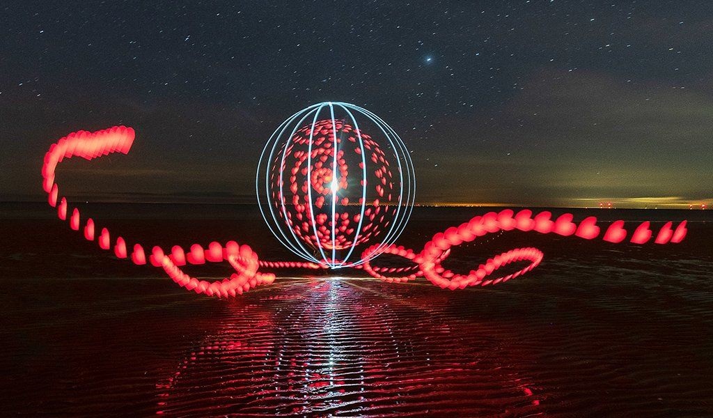
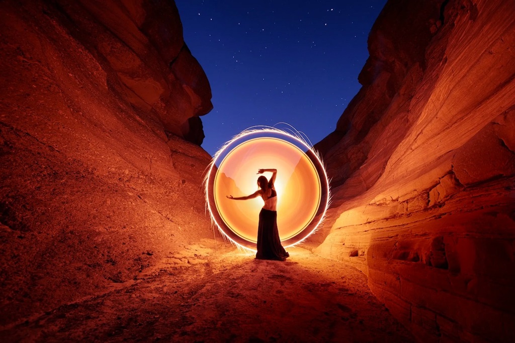
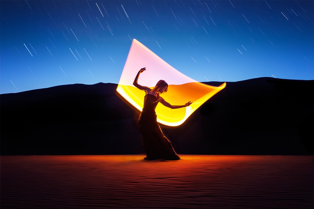
Front lighting tends to look flat and foreground shadows distract. Side lighting adds shape and depth. Backlighting creates silhouettes or lens flare. Play with the angle of light to create more dynamic compositions.
Diffusion
The bigger and closer the light source, the softer and less contrasty the shadows. A giant diffuser like an overcast sky delivers gently modeled light. Crisp small sources like the sun cast sharply defined shadows that accentuate textures.
Luminosity
The brightness of the light impacts the camera’s exposure settings. But luminosity also contributes to the feeling of an image. A dim candlelit scene feels intimate. The strong midday sun makes colors pop. Use these variations creatively!
Combinations
Of course, most lighting situations involve a complex dance of all these factors. Pay attention to the qualitative impacts and learn to work skillfully with whatever illumination you have.
Controlling Light and Color
Chasing the best natural light is a Child’s Pose. Advanced yoga comes with knowing how to tweak what you’re given. Let’s go through some key ways to master and manipulate lighting.
White Balance
This basic camera setting neutralizes color casts from mixed lighting, so whites look truly white. Get it right in camera, or adjust to creative effect later.
Polarizing Filters
These remove reflections and boost saturation. Darken blue skies. Punch up foliage and florals. A must for outdoor color work.
Reflectors and Diffusers
Use these simple modifiers to bounce light into shadows, soften harsh sun, reduce contrast, and open up detail.
Off Camera Flash
This artificial light source lets you sculpt direction, color, diffusion, and luminosity. Once you go strobe you’ll never go back. Discrete speed lights open infinite creative possibilities.
Post Production
All the tricks above help capture color relations and light effects at the moment. But software tools enable further refinement of hue, saturation, luminance masking, and beyond. Master color space conversions, channel mixing, selective adjustments, black point and white point calibration, and more for ultimate control.
Composition and Light
We get dazzled by glorious light and electric color, but remember that composition is still foundational. No amount of chromatic brilliance can save a poorly constructed image. Vibrance is wonderful but needs structure and balance. Some key compositional techniques for color images include:
Rule of Thirds
Place key subjects and rich color elements on the visual power points and intersections. Lead the eye into the frame.
Framing and Layers
Use elements like flowers, branches, tunnels, or doorways to frame focal points. Overlap translucent objects. Build depth through foreground/background separation.
Leading Lines
Draw the viewer through the image via linear elements like fences, shorelines, and roads. Lead toward colorful subjects or light effects.
Patterns and Symmetry
Repeating design elements pleases the brain. Reflections and mirror images evoke intrigue. Frame shots to isolate kaleidoscopic color patterns.
Minimalism
Clean simple compositions with lots of neutral negative space put the spotlight on small saturated accents. Restraint maximizes brilliance.
Playing thoughtfully with all these interrelated elements—rich color, luminous light, balanced form—is what takes our images from snapshots to fine art. It’s a lifelong endeavor, but break it down step-by-step just like learning to paint. Master the basics, practice constantly, study the masters, and find your unique stylistic voice. Be intentional. The camera is just a tool—you provide the vision.
Last Words
That box of chunky Crayolas back in preschool looked so alluring to budding artists. But creating works to wow the soul takes more than just an alluring set of materials. Understanding color theory helps. Thoughtful composition guides the eye. Mastering light transforms a scene. But real mastery happens through practice, study, critique and constantly pushing your skills. The same is true with cameras. Sure higher-end gear captures more gorgeous color and light. But it takes vision and skill to craft masterpieces from the raw pixels. So get out there with your sensor and lenses—and start joyfully smearing some color!
Now, let’s tackle some common questions about color and light photography:
FAQs
What white balance setting should I use?
Choose the setting that neutralizes any color cast and makes whites actually white, whether that’s auto, sunlight, shade, cloudy, flash, etc. You can always tweak the temperature later.
How do I get rich black tones instead of muted gray shadows?
Use contrast controls, level adjustments, or luminosity masking to target and selectively deepen just the dark tones while protecting highlight detail.
Is shooting RAW better for color and light control?
Absolutely! RAW files retain way more color data and flexibility than JPEGs when editing white balance, recovering blown highlights, opening up crushed blacks, adjusting saturation and hue, etc.
What lens upgrades best capture vivid color and light?
Start with a polarizing filter to boost saturation and cut glare. L-series glass with premium optics and coatings reproduces truer, more brilliant color. Prime lenses generally outperform zooms.
Should I upgrade my camera for improved dynamic range and color depth?
Only if you’ve truly hit the limits of your current gear. Skill, lighting knowledge, lighting modifiers, and lenses may impact photos more than higher megapixels or sensors. Focus budget on lenses over new bodies.


