
Light Dark Background Photography: Tips for Post-Processing
I want to let you in on my best-kept secrets for making your images pop when you’re shooting against light dark background photography. I know the struggle with getting those background exposures just right while still nicely exposing your subject. But with some simple post-processing tweaks, you can take your images from flat to fab. Stick with me through this hand-holding guide, and you’ll pick up tips even advanced editors use all the time. I’m gonna walk ya through it step-by-step, pointing out potential pitfalls and how to avoid them. Think of me as your photography processing guru! Let’s get to makin’ some magic.
Conquering Bright Backgrounds
We’ve all been there – you find a spot with a gorgeous bright sky or colorful painted wall that’ll make the perfect backdrop. Except when you review those shots later, your subject looks dull and underexposed compared to the bright background. Cue photo frustration!
Luckily, these types of scenes are highly editable, and I’ve got all the insider techniques to make them work. The key tools we’ll leverage are layers, masking, and several Adjustment Layer types. Grab your mouse, and let’s get to enhancing!
Brush On Some Exposure Love
Sometimes all your subject needs is a little extra exposure TLC. Let’s cater to them with a transformative yet simple touch-up.
Create a new Adjustment Layer by clicking the half black/half white circle at the bottom of the Layers panel and choose Exposure. Use your masking brush to paint over just your subject. Then dial the Exposure slider upwards to brighten.
I’d keep it under +1 stop exposure to start. You can always add more. Make sure the transition looks natural, painting more masks until our star pops nicely from the bright environment.
Already this helps your subject compete visually! But we can still improve the pic overall with more tricks up my sleeve.
Illuminate With Local Dodging
This next technique lighting gurus use is called dodging. It brightens up shadowy spots, almost like you’re shining a flashlight on those areas alone. We’ll apply it here locally just to your subject for dimension-adding glow.
Start by creating a new blank layer above your photo layer. Then switch your foreground/background colors to black/white by pressing D. Choose a soft, low-opacity white brush and paint over any shadowed regions on your subject that need some love.
I like to focus especially on eyes, facial contours, clothing creases and dark hair. The white will subtly lighten those zones as if light’s bouncing off a 3D form.
Pro tip: Lower brush Flow to build the illumination up slowly. And use new layers for separate dodge areas to control the effect better.
Once you’ve spotlighted key zones, adjust those dodge layers’ opacity and/or erase any over-lit regions. We just want a delicate kiss of light here, so less is often more.
Channel Your Brights
Here’s a technique color-correctors swear by for natural-looking brightness enhancement on people. It works by isolating and manipulating skin tones only. Pretty slick, huh?
Add a Black & White adjustment layer. Then change its blend mode to Soft Light or Overlay (I prefer Soft Light generally on folks).
Now click the adjustment layer icon again and re-select Black & White. In the panel menu, click the color squares to see the separate RGB channel views.
Red channel typically shows off the most skin brightness, so select that one. Then dial opacity back on that Black & White layer around 30-60% or until your subject has subtle glowing dimension.
The rest of the pic stays unchanged for very targeted beautification! For bonus effect, try other channels too like green or blue depending on the photo.
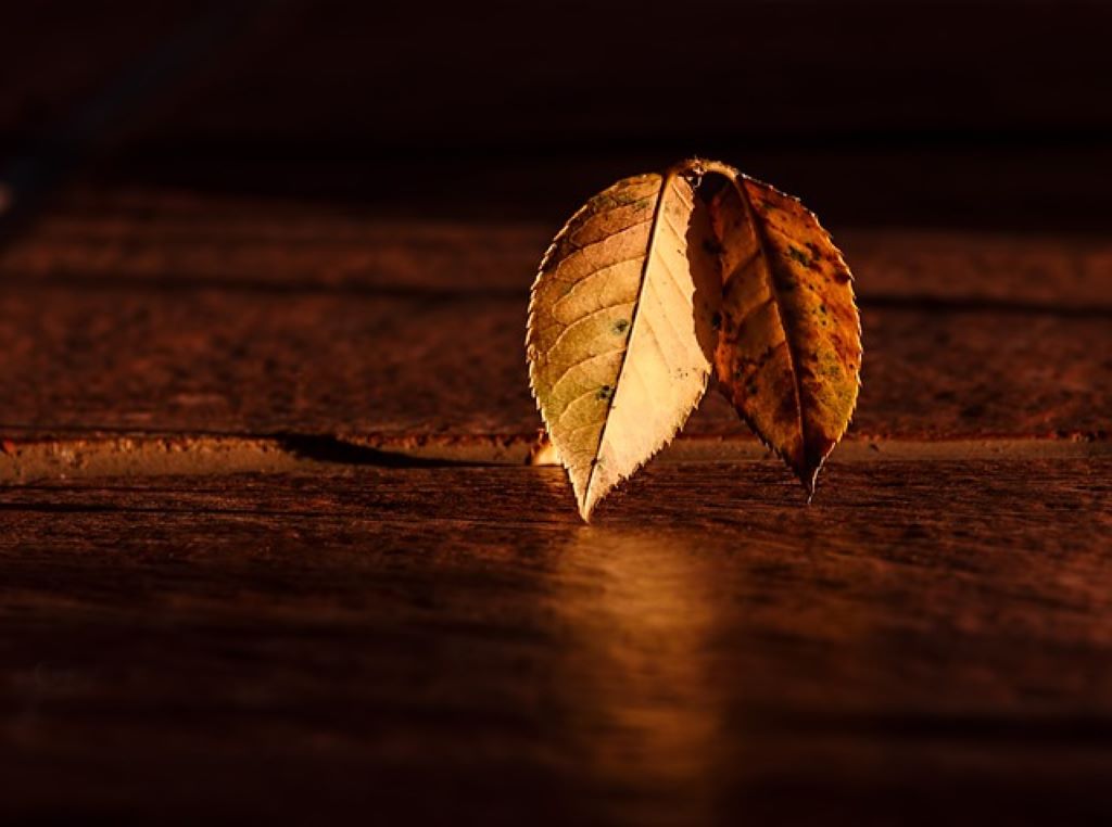
Smoothing Dark Backgrounds
On the other end of the exposure spectrum, we have our murky dark backgrounds that completely overpower the subject. It’s hard to make details stand out once things go pitch black.
But using calculated brightness tweaks – namely dodging and burning – we can make your subject pop while keeping the moodiness intact. I’ll explain these methods plus leveraging blending modes for added wow-factor.
Burn For Separation
Burning is dodging’s opposite: it deepens dark tones in areas painted, increasing contrast/dimension. We’ll use it here to make your subject stand clearly apart from that dreary dark background.
Start by creating a new Curves adjustment layer. Click the curve line about midway to add a point and drag down slightly to darken everything.
Then invert the layer mask (so the effect hides your subject) and paint back over them to reveal that global darkness only in the background zones. This makes things sufficiently moody.
Now switch the Curves layer blend mode to Soft Light or Linear Burn and dial back opacity around 30-50% if needed. The background maintains richness without swallowing your subject!
You can also use a Levels or Exposure adjustment layer instead of Curves here if you prefer. Same deal!
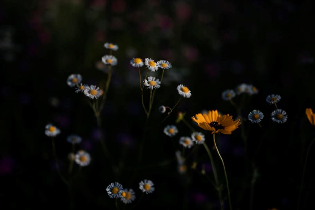
Local Dodging For Precision Pops
Earlier we used painting white to “dodge” our subject against a bright background. We can also dodge locally here for specific subject lighting against the darkened backdrop.
Create a new blank layer and choose a very soft, low-opacity white brush. Then gently paint over areas you want to illuminate, like faces, outfits, front of your car in a night shot.
I like to use separate layers for major subject zones to control the effect better. Change layers’ opacity and erase over any regions getting too bright.
Again, we want delicate enhancement here. So build it slowly and aim for slight glows emulating light-off-forms. This adds nice spirit-lifting luminescence!
Dial Down Highlights
Alright, we’ve nudged up shadows/midtones. Now let’s teach those highlights some restraint so they don’t distract. I’m gonna share a simple trick to tone down hot spots.
Add a new Curves adjustment layer and create an inverted S-curve by adding two points: one pulled up, one pulled down. Then target just the graph’s upper section covering highlights by dragging the top point towards the bottom.
This formation dims overly bright zones only, containing highlights so they don’t flare. Dial back opacity if needed then brush on a layer mask to reduce in areas still too luminant.
Voila – richer, more unified tones! Our eyes read images with restrained highlights much easier. This takes yours from amateur blastiness to refined and pro-ready.
Creative Color Enhancements
We’ve covered the foundations: targeted exposure editing so your subject stands out beautifully against any backdrop. Now let’s dive into my personal color grading spice cabinet to take things up a creative notch!
These enhancements range from subtle magic to drama-building transformations. Get ready to fall in love with these looks.
Mixing Color Channels
Want passionate tones fast? By swapping channels between two duplicated photos, we create wild new hues!
Open your image twice to have two separate documents. Then add a Black & White adjustment layer to each (leave color blend modes alone).
In one document, click the adjustment layer icon and select the Red filter under Channel Mixer. Then load the other document and choose the Green or Blue filter instead under its Channel Mixer.
Now copy the full Red channel version and paste it as a new layer into the Green/Blue one, placing it above the photo layer. Set the pasted layer blend to Color.
The Red channel’s photo layer combines with the Green/Blue channel version, mixing colors to generate unreal magical hues! Blast off into color space fantasy!
Gradient Map Moodiness
Gradient maps are shortcut texture tools we can use for quick stylized color grades. Let me show you how to get moody fast with these bad boys.
Lock your photo layer transparency then place a Gradient Map adj layer above it. Click the gradient preview to open the Editor panel.
I like pairing deep jewel tones that complement the image’s palette. Create your gradient then click Randomize until you land on a compelling rich variant.
Once satisfied, change the layer blend mode to Soft Light or Overlay. Then dial opacity to taste. With just clicks, ta-da – instant sultry sophistication!
For bonus credit, add a black and white Gradient Map on an overlay blend at 30-50% opacity before the colors one. This adds extra dynamic neutral contrast underneath. Luxe!
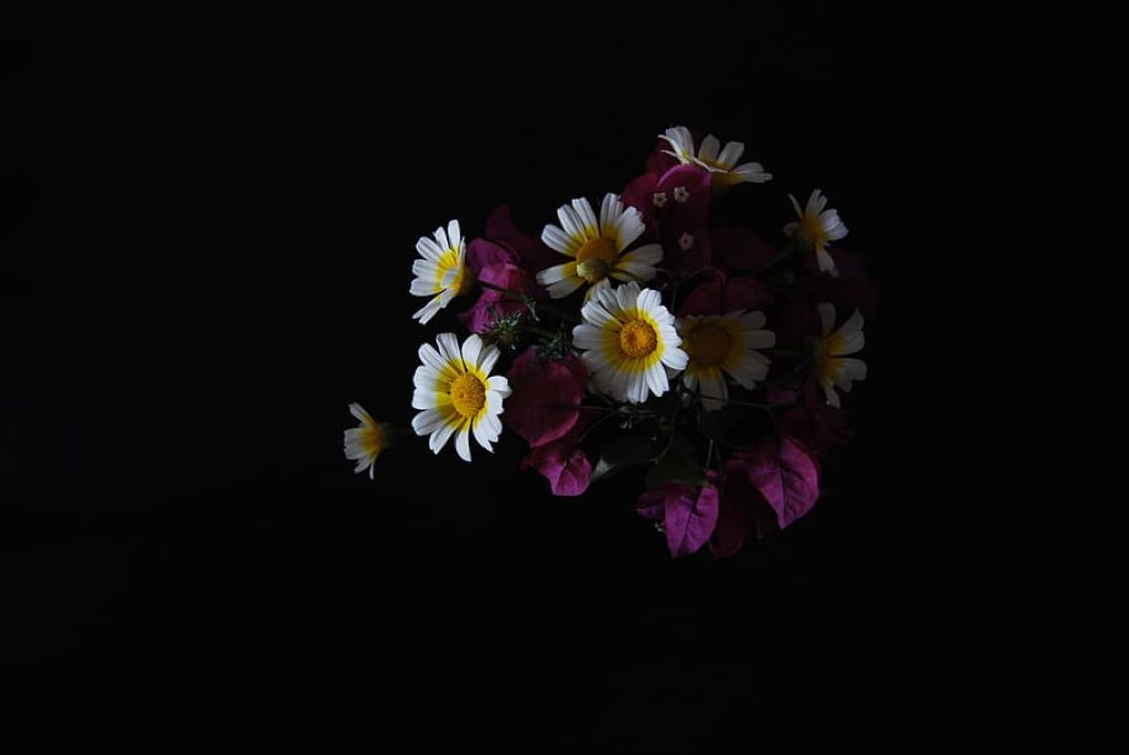
Color Splash Pop
Alright, last one! Let’s kick things into high gear with a vibrant splash of color pop. Use this to hero your main subject element against a faded backdrop.
Add a Black & White adjustment layer above your image to desaturate everything initially. Then hold Ctrl/Cmd while clicking the layer icon to load its embedded layer mask.
Grab a soft white brush and gently paint back color over the zones you want accentuated in vibrant tone. Faces, outfits, vehicles, foliage – go to town!
Lower the adjustment layer opacity a touch if needed so the color integrations look natural. Finish by adding a Vibrance adjustment layer (20-30% dialed up) to amp saturation specifically in the splashed regions. Ta-daaaa!
FAQs
- How do I prevent skin tones from getting weird colored halos along high contrast edges?
Use a Refine Mask brush on any complex or hair-lined masks to help them conform tighter to desired zones. Edge halos come from imperfect masks letting adjustments sneak through. Refining cleans that right up!
- Adjustment layers work great at first, but then reversing them or deleting seems to ruin my image – help!
Yep, this is an annoying pitfall! The best way to allow non-destructive editing is utilizing adjustment Layer Masks. That way you can erase to tweak effects vs removing the whole layer. Also clipboard copy your base image to revert to if needed.
- No matter what I try, my subject still looks obviously edited against the background. How do I make changes blend more seamlessly?
Good question! This issue often comes down to adjustments being too strong and not matching the surrounding tones. Try dialing opacity down on your layers until changes look natural in context. Building up gently is key.
- Is there any advantage to using Photoshop over Lightroom for this kind of editing?
Absolutely! While Lightroom handles basics, Photoshop opens far greater creative control with blend modes, masking and layering options. This allows those advanced enhancing techniques we covered like targeted dodging and burning, channel mixing, gradient maps etc.
- Do you have any tips specifically around bright or dark landscape shoots?
Similar principles apply! On bright ones, use brush exposure bumps on foreground elements and darken highlights with luminosity masks. For dark landscapes, illuminate subjects in focus with small dodging paints while keeping brooding ambience. Straighten lines with lens profile corrections if needed too against high contrast edges.
The Wrap Up
Phew, we covered a ton of ground here! From exacting exposure rescues to imaginative colors, you now hold limitless options for handling images with challenging bright or dark backgrounds. Enhance your photography with beautiful backdrop ideas for your wooden backdrop stand; the key is blending targeted adjustments seamlessly into the scene, mastering the art of control with feathered masks and perfect opacity levels—so experiment until you nail what works for each unique photo. Armed with this knowledge, no tricky lighting situation can stop you! Have fun unleashing your new technical and creative chops. If you hit any other sticking points, drop me a line and I’m happy to help troubleshoot!


